Understanding Color Contrast to Maximise Visual Effect
By Geoff Harris •

The type of colours that you use in a photograph will fundamentally affect the way that photo works. For instance, if you want a gentle, moody image, then you should choose soft, pastel colours.
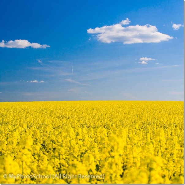
If you want a picture with impact, then you’re more likely to use strong, saturated colours. And for maximum impact with these, you might want to make use of colour contrast.

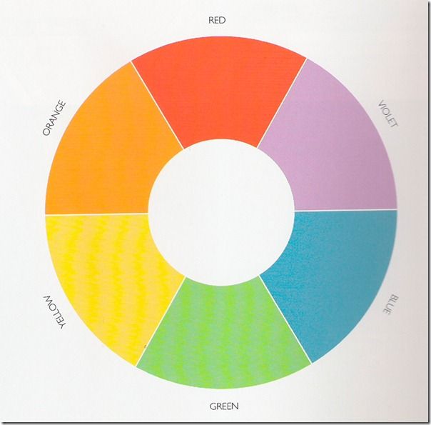
To find out which colours contrast most strongly with each other, you need to think about the colour wheel, or colour circle. This has been around for several hundred years as a diagrammatic representation of the way different colours interact with each other. There are various different aspects of this, but today I want to look at contrasting colours.
Any pair of colours which are directly opposite to each other on the colour wheel are known as complementary colours, and will give the strongest colour contrast.
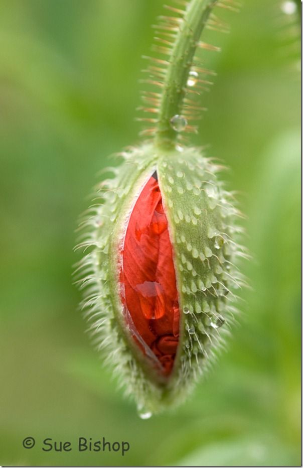
So if you have a red subject, for instance, and you want to give it maximum impact in your photograph, you would put it against a green background. Similarly yellow will contrast most with violet, and orange will have most impact against blue.

However, you also need to bear in mind that the reds, oranges and yellows are dominant colours, and leap towards the viewer, while the blues, greens and violets are receding colours, and don’t leap out from the picture.
This means that while a red subject will leap out from a green background, if you use the same pair of complementary colours the other way round and have a green subject against a red background, there may be a feeling of visual imbalance, because the background is a more dominant colour than the subject.
The more saturated your colours are, the more impact the colour contrast will have. So although pink (which is a diluted version of red) will contrast with green, the contrast won’t be as strong as it is with fully saturated red.
This is just one aspect of the way colours behave. If you’d like to learn more about colour, you might like to take Phil Malpas’s course, A Master Class in Light and Colour.
Stay updated
Receive free updates by email including special offers and new courses.
